Why Color Psychology Works
Color isn’t just a design decision it speaks to how we feel, think, and move. Walk into a room painted in icy blue, and your body relaxes without permission. Step into a bold orange kitchen, and your brain kicks into gear. Color affects mood, focus, and even energy levels, whether we notice it or not. That’s why advertisers use it with precision, and why smart decorators should, too.
Behind the scenes, there’s real science. Our brains process color in the visual cortex. From there, signals sync up with the limbic system the part responsible for emotion and memory. It’s why warm tones (reds, yellows) often create excitement or warmth, and cool tones (blues, greens) tend to calm or ground us. Color doesn’t just decorate a space it sets the pace for how we experience it.
That’s where intentional decorating comes in. Following trends might make your space look current, but it won’t always feel right. Decorating with intent means asking, “What do I want this room to do for me?” and then choosing palettes that help make that happen. Whether you need a quiet retreat or a lively gathering spot, color becomes a tool, not just an aesthetic choice.
Energize and Focus: Kitchen & Home Office
Color affects more than just aesthetics it actively shapes how we think, feel, and interact in our spaces. For high energy, high function areas like the kitchen and home office, the right palette can inspire both creativity and focus.
Activate the Mood with Vibrant Tones
Bright, energizing colors work especially well in kitchens, breakfast nooks, or collaborative workspaces.
Yellows stimulate positivity and conversation, making them ideal for gathering spaces.
Light greens offer a fresh, natural kick that balances energy with harmony.
These shades can uplift the mood and encourage productivity when used on walls, shelving, or accents.
Create Clarity with Cool Blues
In home offices or desk corners, maintaining focus is key. Cool tones can help calm the mind and support clear thinking.
Soft to medium blues offer a calming effect, making them great for concentration heavy zones.
Pair with ergonomic furniture and clean lighting for a holistic workspace vibe.
Use Red Carefully If at All
Red can be powerful but in high function spaces, too much of it can overwhelm the senses.
Avoid strong red hues unless they’re balanced with more muted colors.
Use as an accent (e.g., in artwork or accessories) rather than a dominant tone.
In small doses, red can add warmth and energy without causing fatigue.
Key Takeaway
Functional spaces thrive when color supports both mental energy and emotional balance. Think of your palette as a productivity tool not just a style choice.
Calm and Restore: Bedrooms & Bathrooms
Create a sense of peace and rejuvenation by choosing colors that support rest and relaxation. Bedrooms and bathrooms are your personal sanctuaries spaces where color truly affects your mood and energy levels.
Soothing Colors That Ease the Nervous System
When it comes to rest oriented spaces, soft and muted tones are your best friend. These shades naturally slow the mind and body, making it easier to unwind.
Soft blues evoke serenity, resembling clear skies and calm water
Muted greens bring balance and a subtle connection to nature
Warm neutrals like taupe, beige, or oatmeal add a layer of warmth and comfort without overpowering the space
These tones are especially effective in promoting deep rest, lowering stress levels, and making bedrooms and bathrooms feel like true retreats.
The Strategic Use of Darker Shades
Contrary to popular belief, dark colors don’t have to overwhelm. When used intentionally, they can add stunning depth and intimacy to a room.
Deep navy or forest green on an accent wall can make a bedroom feel cozier and more grounded
Charcoal tones in a bathroom create a spa like, cocooning effect
Combine dark shades with soft lighting to enhance the soothing atmosphere
Use these richer tones sparingly or to frame specific features (like a headboard wall or soaking tub) to create a feeling of enclosure without claustrophobia.
Don’t Forget About Lighting
Lighting and color are deeply interdependent. What looks warm and inviting in natural morning light might feel flat under artificial lighting at night.
Natural light cools down colors and can highlight undertones you didn’t notice at first
Warm interior lighting enhances cozy colors, while cool LEDs may wash them out
Test samples at different times of day to see how they shift in tone and impact your space
For bedrooms and bathrooms, prioritize layers of light combine overhead fixtures with ambient and task lighting to influence color projection and mood.
Balancing calming hues, strategic depth, and adaptable lighting will help you design restorative rooms that recharge both body and mind.
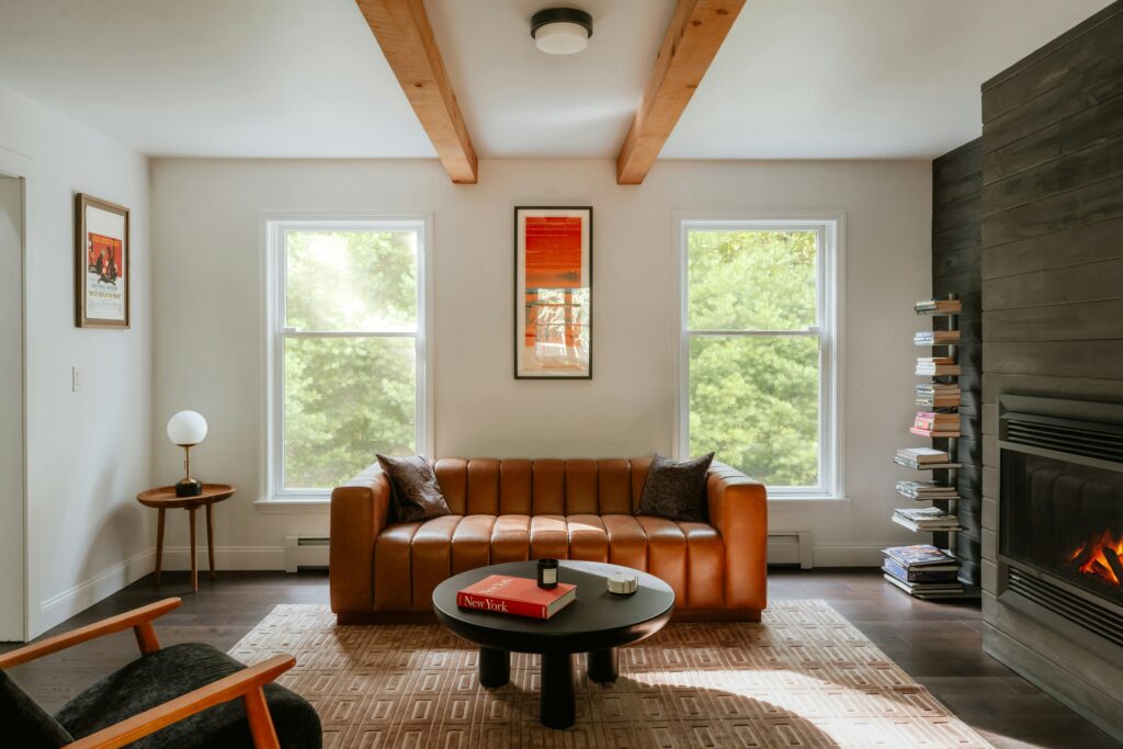
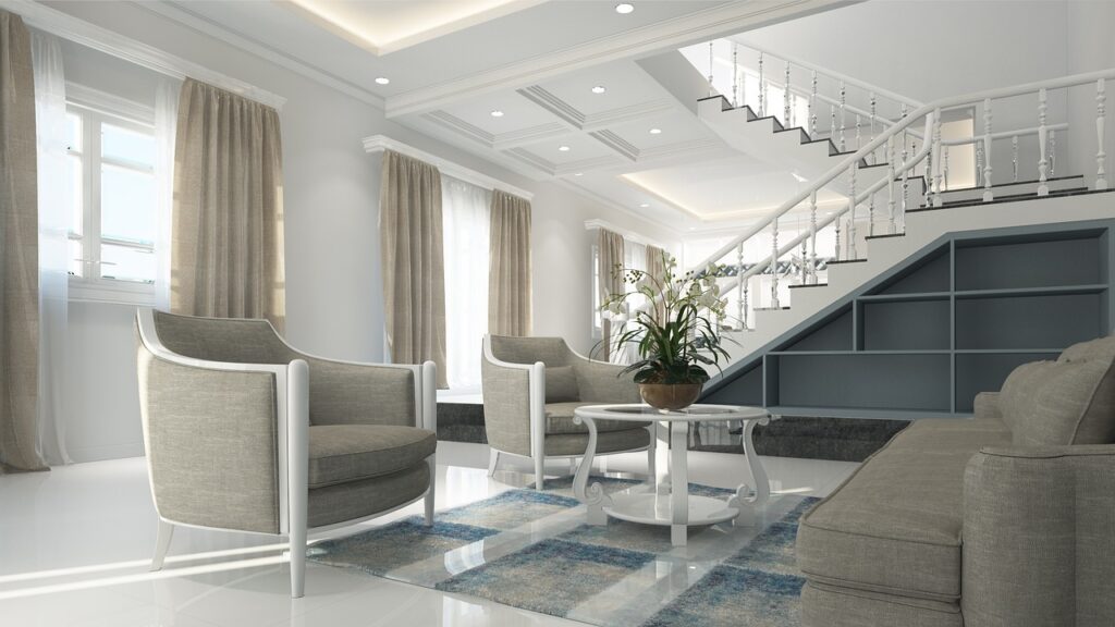
Host and Inspire: Living & Dining Rooms

The living and dining rooms serve as social hubs in most homes, making them ideal spaces to use color that encourages connection, warmth, and inclusive energy. Choosing the right palette in these areas is less about decorating for impact and more about designing for comfort, function, and mood.
Ground the Space with Earthy Tones
To create a welcoming and grounded atmosphere:
Terracotta: Adds a warm, rustic feel that grounds conversations and brings in a natural sensibility.
Caramel: Offers subtle richness without being too dark ideal for cozy gatherings.
Olive: A versatile green that balances earthiness with sophistication.
These tones work well as base colors for walls, upholstery, or rugs.
Keep it Engaging with Subtle Accents
To avoid visual fatigue or a dull atmosphere, layer in pops of color that catch the eye without overwhelming the senses:
Use accent pillows, throws, or artwork in complementary shades like rust red, burnt orange, or navy.
Incorporate reflective textures or metallic finishes in gold or bronze to add dimension.
Stick to one or two accent shades per room to maintain cohesion.
Design for Use and Atmosphere
Your palette should support daily life while enhancing the setting:
Think about how you’ll use the space dining rooms often benefit from deeper, more intimate colors, while living rooms can go lighter for openness.
Incorporate flexible lighting options (e.g., dimmable fixtures or layered lamps) to adapt the mood.
Choose furniture and textiles that complement your color scheme without dominating it.
By merging earthy foundation tones with intentional accents and practical design choices, you can craft living and dining rooms that feel both inspiring and lived in.
Creative Play: Kids’ Rooms & Studios
Color in creative spaces shouldn’t be shy. Bold primaries reds, yellows, blues spark energy, curiosity, and hands on play. They’re simple, direct, and powerful enough to invite exploration without overthinking.
But there’s a line between energetic and overwhelming. To keep the space from turning chaotic, grounding those primary pops with calmer tones soft grays, muted greens, or warm creams helps balance stimulation. Think of it like visual breathing room.
Flexibility matters too. Kids grow, hobbies evolve, and taste shifts. Build a base palette that allows for changes. Choose modular elements like colorful storage bins, removable wall decals, or statement rugs that can be swapped out without a full redesign. That way, the space stays dynamic, not disposable.
Choosing the Right Palette for Every Room
Start here: every room has a job to do, and color should help it do that job better. Think about function first calm neutrals in a bedroom, energizing greens in an office, warm tones for hosting spaces. Then layer in personality. Is this a sleek minimalist spot or a boho hangout? Your palette should reflect that vibe without getting in the way.
Finishes, undertones, and light matter more than most people think. A matte olive isn’t the same as a glossy one. That pale gray might turn blue in natural light, or go beige under a bulb. Take five minutes to look at your paint under daylight, evening light, and overhead light you’ll catch surprises early.
Finally, size and layout should guide your choices. Large rooms can handle contrast and moodier tones. Smaller spaces usually open up with lighter colors, unless you’re intentionally leaning into a cozier feel. Don’t just pick shades you like pick ones that work. This guide on how to choose color palette breaks down how to get it right, room by room.
Final Tips for Color Confident Decorating
Start with testing. One paint color under morning light can look totally different by late afternoon and completely wrong under artificial bulbs. Don’t rush this step. Test swatches on multiple walls, and live with them for a few days. You’ll catch what works and what clashes before committing.
Next, experiment with color without picking up a roller. Throw pillows, rugs, curtains, art these are low stakes tools to try out a palette. They give you a feel for what resonates without locking you into hours of painting or repainting.
More important than rules? Feel. Build each room around how you want to feel in it. Energized? Stick with brighter tones and sharp contrasts. Calm? Go for soft transitions and earthy bases. A space should support your life, not fight with it.
Overwhelmed or just getting started? Get practical and intentional help with this guide: choose color palette.
 Norvain Zyphoris has opinions about home design inspirations. Informed ones, backed by real experience — but opinions nonetheless, and they doesn't try to disguise them as neutral observation. They thinks a lot of what gets written about Home Design Inspirations, DIY Home Projects, Gardening and Landscaping Ideas is either too cautious to be useful or too confident to be credible, and they's work tends to sit deliberately in the space between those two failure modes.
Reading Norvain's pieces, you get the sense of someone who has thought about this stuff seriously and arrived at actual conclusions — not just collected a range of perspectives and declined to pick one. That can be uncomfortable when they lands on something you disagree with. It's also why the writing is worth engaging with. Norvain isn't interested in telling people what they want to hear. They is interested in telling them what they actually thinks, with enough reasoning behind it that you can push back if you want to. That kind of intellectual honesty is rarer than it should be.
What Norvain is best at is the moment when a familiar topic reveals something unexpected — when the conventional wisdom turns out to be slightly off, or when a small shift in framing changes everything. They finds those moments consistently, which is why they's work tends to generate real discussion rather than just passive agreement.
Norvain Zyphoris has opinions about home design inspirations. Informed ones, backed by real experience — but opinions nonetheless, and they doesn't try to disguise them as neutral observation. They thinks a lot of what gets written about Home Design Inspirations, DIY Home Projects, Gardening and Landscaping Ideas is either too cautious to be useful or too confident to be credible, and they's work tends to sit deliberately in the space between those two failure modes.
Reading Norvain's pieces, you get the sense of someone who has thought about this stuff seriously and arrived at actual conclusions — not just collected a range of perspectives and declined to pick one. That can be uncomfortable when they lands on something you disagree with. It's also why the writing is worth engaging with. Norvain isn't interested in telling people what they want to hear. They is interested in telling them what they actually thinks, with enough reasoning behind it that you can push back if you want to. That kind of intellectual honesty is rarer than it should be.
What Norvain is best at is the moment when a familiar topic reveals something unexpected — when the conventional wisdom turns out to be slightly off, or when a small shift in framing changes everything. They finds those moments consistently, which is why they's work tends to generate real discussion rather than just passive agreement.