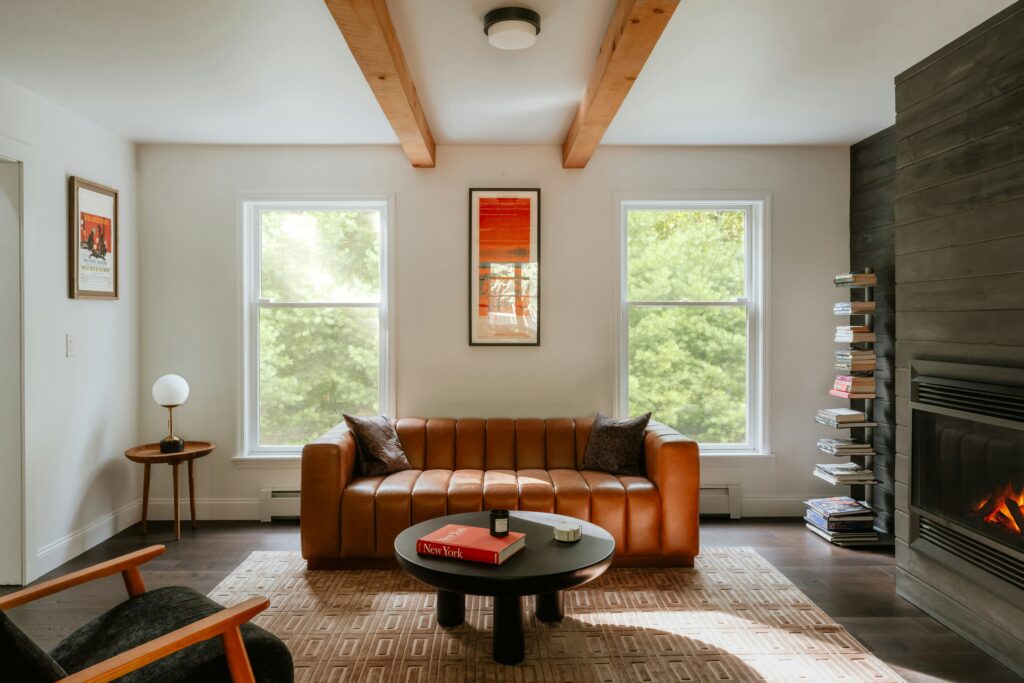
Know Your Core Metal
Before you start layering finishes like a design pro, pick one metal to lead the way. Think of it as your anchor brass, chrome, matte black, or whatever else fits your space. Once you’ve chosen, this finish becomes the backbone. It sets the visual tone and makes the rest easier to build around.
The key is to commit. A dominant finish should show up in major features cabinet hardware, lighting, maybe even furniture legs. This keeps the look grounded and gives the eye something familiar to land on, no matter how bold your mix gets.
So how do you choose your starting metal? Base it on your style. Love warmth and vintage vibes? Go brass or copper. Need something crisp and modern? Chrome or brushed nickel works. Matte black feels bold and graphic great for industrial or minimalist settings. The goal isn’t to match everything but to create a base layer that makes the rest feel intentional.
Once your core finish is in place, the rest your accent metals can play off it. But without that foundation, it’s easy for a room to feel scattered. Start solid. Then mix with confidence.
Stick to a Complementary Palette
When you’re mixing metals, it’s a balancing act between warm and cool tones. Warm metals like brass, gold, and copper bring richness and glow. Cool tones think chrome, nickel, and pewter add a sleek, modern edge. The key isn’t to pick sides. It’s to create contrast that feels deliberate, not chaotic.
Start by choosing which side of the metal spectrum your space leans toward. Then, bring in one or two accents from the opposite end to give it tension and depth. Say you’re building around warm brass; a splash of cool chrome in a lamp base or art frame can keep things from skewing too vintage or heavy.
Avoid metal overload. Limit your palette to two or three finishes, max. That’s enough for visual interest without veering into clutter. Stick to repeating each finish in at least two spots a cabinet pull here, a mirror frame there. It makes the mix feel designed, not accidental.
Vary the Textures, Not Just the Tones
When people think of mixing metals, they usually jump straight to color gold with chrome, brass with black. But the real magic? It’s in the finish. Matte, polished, brushed each surface tells its own story without shouting. A brushed nickel sconce reads warm and grounded, while a polished chrome handle throws light across the room. Layer them right, and you get contrast that feels intentional, not chaotic.
Mixing textures does two things: it adds depth and keeps the eye moving. Even if you’re sticking to just two metal tones, combining finishes can make a space feel richer without tipping into clutter. Think of it like pairing denim and leather different textures, same understated cool.
Bottom line: texture often speaks louder than color. It creates character, not just shine. So don’t just match tones. Mix feels.
Use Repetition for Visual Unity

Mixing metals isn’t about throwing a handful of finishes into a room and hoping they play nice. Repetition is what creates clarity. If you’re using brass, let it show up at least twice maybe in your light fixture and your drawer pulls. Same goes for black or nickel. The eye reads repetition as intention.
Spread your finishes out. Don’t cluster them all in one corner. If your mirror frame is matte black, carry that hue over into a table lamp or chair leg somewhere else. This kind of spatial echo keeps the room from looking chaotic. Instead of randomness, you get rhythm.
Think of it like a melody, not a mixtape. Repeated notes help the whole thing feel pulled together, not patched together.
Let Function Guide Placement
When it comes to mixing metals, the where matters just as much as the what. Start by grouping hardware like drawer pulls, cabinet handles, or door knobs in one consistent finish. That repetition keeps the visual story tight and avoids the mishmash look. It’s especially important in kitchens and bathrooms, where hardware is plentiful.
Accent metals? They’re your chance to break the rules on a smaller scale. Think gold edging on a picture frame, a bronze rim on a vase, or metal legs on a statement chair. These touches add dimension without stealing focus.
Bigger pieces, like mirrors or pendant lights, are your stage for bolder choices. Go for an unapologetic finish if it feels right. A brushed black steel mirror or a copper pendant can elevate an entire room and serve as an anchor for other accents around it. Just make sure it’s intentional, not accidental. Let function be the map, and style will follow.
Pair With Confident Patterns and Neutrals
Metal accents need room to breathe. That’s why neutral backgrounds think warm whites, soft grays, or muted earth tones are the foundation of a balanced metal mixed space. They let your brass mirror or black matte sconces stand out without fighting for attention.
If you want to mix in patterns or textures, stay strategic. Overdoing it turns bold into busy fast. Stick to a method: layer scales (like a wide stripe next to a fine print) and keep your color palette tight. This helps your metals stay the visual punctuation in the room, not background noise.
Need a hand with pattern pairing? Head over to this practical mixing patterns guide to avoid making your space a sensory obstacle course.
Finish with Intention
Mixing metals shouldn’t feel like you’re trying to win points this isn’t a trend chasing game. It’s about creating a space that reflects your taste, not someone else’s Pinterest board. The best metal combos feel intentional because they align with the overall mood of the room. That brushed brass knob or black steel lamp should add tension or warmth but not scream for attention.
Let metallics support, not dominate. They’re great side characters. If your space feels like a showroom of finishes, you’ve gone too far. Good design uses metals to build rhythm and detail, not chaos.
Bottom line: a well mixed room doesn’t look like it tried too hard. It fits together the way a good outfit does balanced, easy, and comfortable. That’s the aim.
 Tamarase Crisman has opinions about interior decorating tips. Informed ones, backed by real experience — but opinions nonetheless, and they doesn't try to disguise them as neutral observation. They thinks a lot of what gets written about Interior Decorating Tips, Sustainable Living Practices, DIY Home Projects is either too cautious to be useful or too confident to be credible, and they's work tends to sit deliberately in the space between those two failure modes.
Reading Tamarase's pieces, you get the sense of someone who has thought about this stuff seriously and arrived at actual conclusions — not just collected a range of perspectives and declined to pick one. That can be uncomfortable when they lands on something you disagree with. It's also why the writing is worth engaging with. Tamarase isn't interested in telling people what they want to hear. They is interested in telling them what they actually thinks, with enough reasoning behind it that you can push back if you want to. That kind of intellectual honesty is rarer than it should be.
What Tamarase is best at is the moment when a familiar topic reveals something unexpected — when the conventional wisdom turns out to be slightly off, or when a small shift in framing changes everything. They finds those moments consistently, which is why they's work tends to generate real discussion rather than just passive agreement.
Tamarase Crisman has opinions about interior decorating tips. Informed ones, backed by real experience — but opinions nonetheless, and they doesn't try to disguise them as neutral observation. They thinks a lot of what gets written about Interior Decorating Tips, Sustainable Living Practices, DIY Home Projects is either too cautious to be useful or too confident to be credible, and they's work tends to sit deliberately in the space between those two failure modes.
Reading Tamarase's pieces, you get the sense of someone who has thought about this stuff seriously and arrived at actual conclusions — not just collected a range of perspectives and declined to pick one. That can be uncomfortable when they lands on something you disagree with. It's also why the writing is worth engaging with. Tamarase isn't interested in telling people what they want to hear. They is interested in telling them what they actually thinks, with enough reasoning behind it that you can push back if you want to. That kind of intellectual honesty is rarer than it should be.
What Tamarase is best at is the moment when a familiar topic reveals something unexpected — when the conventional wisdom turns out to be slightly off, or when a small shift in framing changes everything. They finds those moments consistently, which is why they's work tends to generate real discussion rather than just passive agreement.