Why Pattern Mixing Still Matters in 2026
Pattern mixing isn’t just a design trick it’s how a room goes from basic to intentional. Tossing in a few prints without thought might clutter your space, but mixing patterns with style and awareness? That’s when a home starts saying something. It turns blank walls and plain furniture into a curated vibe.
In 2026, it’s also how people are showing up visually. More than ever, homes are expected to reflect who you are your interests, confidence, and taste. Mixing stripes with florals or combining global prints with modern geometrics shows you’re paying attention, not playing it safe. It’s a quiet flex of visual sophistication without having to over explain anything.
Plus, pattern mixing isn’t going anywhere. Whether you’re into clean lines with bold accents or full on maximalist expressions, pattern play fits into almost every style language. Lean into contrast or go subtle it all works, if there’s intention behind it. That’s the difference between clutter and character.
DO: Start with a Consistent Color Palette
Pattern mixing can be bold, but the fastest route to chaos is ignoring color. The fix? Set your foundation with a tight, intentional palette. Shared hues or undertones across your patterns keep the space feeling effortless even when the prints themselves are loud.
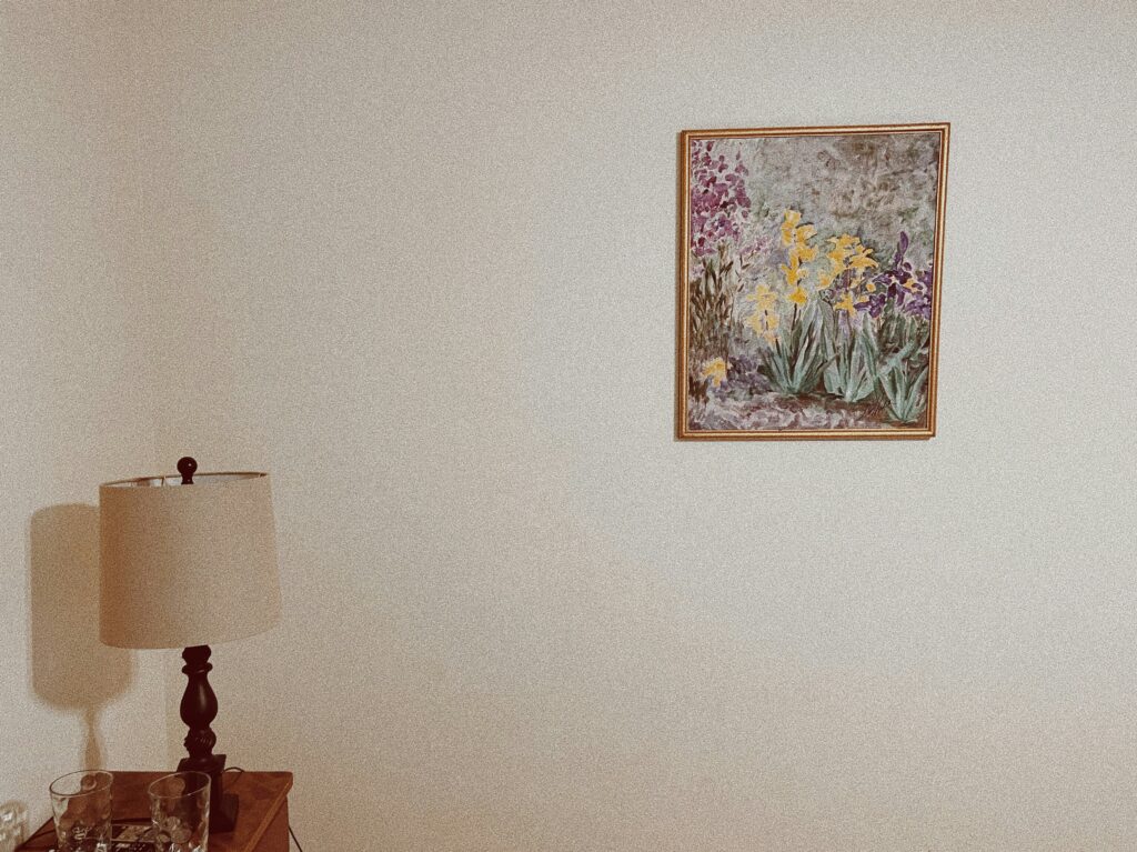
Neutrals are your best allies. Use them to break up stronger motifs and give the eye a place to rest. Think clean walls behind a patterned sofa, or muted floors that let curtains do the talking.
Then, choose one dominant base color. This doesn’t mean everything has to match but anchoring the room with a repeated hue ties disparate elements together. Your eye will naturally connect the dots.
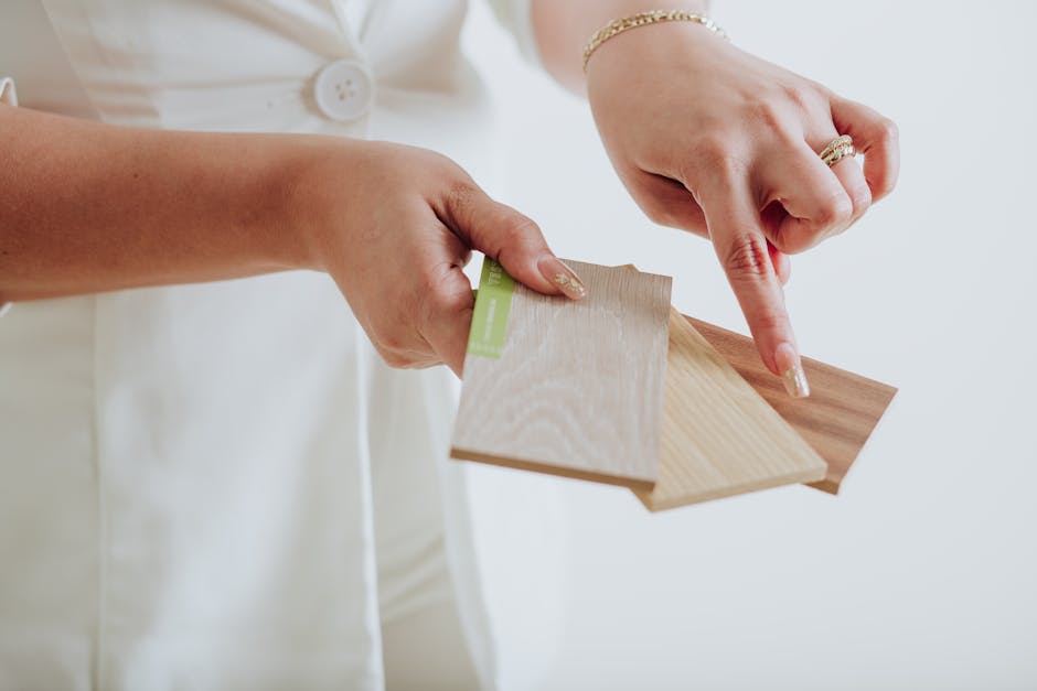
Need direction? Here’s a solid guide on How to Choose the Perfect Color Palette for Any Room.
DON’T: Mix Patterns Without Varying Scale
One of the quickest ways to make a room feel overwhelming is mixing patterns that all shout at the same volume. Think giant florals clashing with equally bold geometrics no one knows where to look, and the space ends up feeling chaotic.
Instead, balance is key. Use large scale patterns as statement makers wallpaper, area rugs, or a standout chair. Then layer in smaller, more restrained patterns like pinstripes, miniblocks, or dotted prints to support the visual rhythm. The goal isn’t to match intensity, but to build contrast and clarity. Large patterns draw the eye, small ones give it somewhere to rest.
Visual hierarchy matters. You want your room to guide, not confuse. When it comes to pattern scale, variation isn’t just a stylistic choice it’s a structure that keeps everything grounded.
DO: Use Pattern Types with Intention
Pattern mixing isn’t about random combinations it’s about curating a visual experience with purpose. Each type of pattern adds a different energy to your space. When chosen intentionally, these elements can harmonize beautifully.
Understand What Each Pattern Conveys
Florals bring softness, nature inspired elegance, or romantic charm
Geometrics offer structure, symmetry, and visual clarity
Stripes introduce movement and can subtly manipulate perception of space (vertical = taller, horizontal = wider)
Abstract designs speak to creativity, spontaneity, and modern aesthetics
Combine Pattern Types for Balance and Contrast
When mixing different pattern types, aim for contrast that complements not chaos that competes.
Balance ornate patterns (like florals) with simpler ones (like stripes)
Mix structured shapes (geometrics) with more organic or flowing patterns (abstracts or florals)
Use color and scale to help different pattern families feel cohesive
Repeat Patterns in Small Doses
Strategic repetition brings rhythm and continuity to your space.
Echo a certain pattern type subtly such as a geometric motif that appears in a cushion and again in wall art
Avoid overdoing it; repetition adds familiarity, not monotony
Let small recurring moments anchor a diverse pattern story
Pattern variety adds character, but thoughtful choices keep it all intentional. Know the role each pattern plays, and mix them with awareness, not guesswork.
DON’T: Ignore Texture

In design, texture pulls more weight than it gets credit for. Visually, it functions like a pattern even when it doesn’t include an actual print. A matte velvet, a glossy leather, a chunky linen they each add dimension. Layering different textures can bring depth to a room that flat prints alone can’t match.
When everything in a space shares the same surface too much smooth cotton, for example it starts to fall flat. Even with a mix of prints, that sameness dulls the impact. Think of texture as the silent contrast. It catches light differently, adds variety, and makes a space feel lived in instead of staged.
So before you pile on another patterned throw pillow, ask: what does this feel like, not just look like? That question is where pattern mixing starts to really pay off.
DO: Use Solids as Resting Points
Solid colors are your quiet anchors. In a room full of bold prints and layered visuals, they give the eye a place to breathe. Think of them as reset buttons moments of calm that make the rest of the design stand out more. A solid sofa or neutral wall isn’t boring; it’s smart design.
Use solids strategically: upholstery, rugs, or even painted walls can carry the weight of visual rest without dulling impact. In pattern heavy schemes, solids don’t just support they sharpen. They help your patterns hit harder.
Bottom line: not everything has to compete for attention. Let some elements whisper so others can shout.
DON’T: Crowd Everything in One Zone
Pattern mixing isn’t just about selection it’s also about placement. Even with a balanced color palette and varied scales, a room can quickly feel overwhelming if all the patterns are packed into one small area.
Distribute Patterns Intentionally
Avoid clustering every pattern onto one piece of furniture or stacking them into a single corner. Instead, think spatially:
Spread patterns across the room cushions, curtains, rugs, and accent pieces can all carry portions of the visual story.
Let patterns guide the eye around the room rather than creating one overloaded focal point.
Repeat motifs or pattern types selectively in multiple areas to encourage flow, not congestion.
Think in Layers
Use patterns in zones soft textures in one area, bolder shapes elsewhere so no single spot feels saturated. Creating balance through distribution allows each print to stand out without overpowering the rest.
Strategic spacing lets your design breathe. In a well balanced room, every pattern gets its moment without causing visual fatigue.
DO: Test With Temporary Layers First
Before you go big with bold wallpaper or patterned upholstery, start small. Throws, pillows, and wall art are low risk ways to get a feel for how patterns interact in your space. They let you trial run combinations in the actual light and flow of your home where colors shift and your eye lives with the mix day in, day out.
This method isn’t just budget friendly, it’s flexible. Styles change. Your tastes evolve. What wowed you last season might feel loud or tired next year. Smaller patterned pieces are easy to swap and refresh without overhauling the whole room. It’s design with a backdoor and in 2026, that kind of fluidity matters.
DON’T: Follow Trends Blindly
The hottest pattern on your feed might look great in someone else’s loft but that doesn’t mean it belongs in your living room. Trends can offer inspiration, sure, but they shouldn’t dictate your decisions. Always gut check what’s trending against what actually works for you: your space, your habits, your temperament. Are you really a bold checkerboard wallpaper kind of person or do you just like the way it photographs online?
Design in 2026 leans more toward staying power than chasing the next visual high. That means finding patterns that hold up over time, not ones that peak and fizzle. Start with what feels right and reflects how you live. If it’s meaningful to you, it will last longer and look better doing it. Let trends inform, not overwhelm. End of story.