Start with the Room’s Purpose
Before you choose a single color, figure out what the room needs to do. Is it a space to focus? To unwind? To host friends? The answer will steer everything from palette to patterns. A home office calls for clarity and alertness, so cooler tones and minimal distractions fit. A bedroom, where rest is the goal, benefits from softness muted greens, dusky blues, maybe a warm neutral for balance.
Colors aren’t just decoration. They shape how a space feels. Blues and greens calm the nervous system, making them ideal for rest or reflection. Reds can spark energy and conversation, which works in spaces like dining rooms or creative zones. Neutrals your beiges, grays, and soft whites are the chameleons. They hold the room steady and give your accent pieces room to breathe.
Lighting seals the deal. Natural light brings out warmth; artificial light can flatten or shift tones entirely. Think about when the room gets used. Morning sun? Cool tones won’t feel so cold. Night owl hangout? Warm lighting paired with muted color keeps things cozy. The palette should work with the light, not fight it.
Plan with function. Let how you live shape what you see.
Use the 60 30 10 Rule
Creating a harmonious color palette doesn’t have to be complicated. The 60 30 10 rule is a tried and true formula that helps you balance colors in any room by breaking them down into dominant, secondary, and accent categories.
What Is the 60 30 10 Rule?
This rule helps you distribute color in a visually balanced way. It avoids overwhelming the space and ensures your palette feels intentional.
60% Dominant Color
This makes up the foundation of your room’s color scheme. Use it on:
Walls
Large area rugs
Major furniture pieces, like a sofa or wardrobe
30% Secondary Color
This adds visual interest and supports the dominant color. Apply it to:
Window treatments (curtains or blinds)
Bedding or throw blankets
Side chairs or smaller furniture
10% Accent Color
Accent colors bring character and energy. These can appear in:
Decorative pillows
Wall art or tabletop décor
Lamps, vases, or statement accessories
Why It Works
Using the 60 30 10 rule helps:
Keep your room’s color palette cohesive
Prevent color overload through structured distribution
Highlight areas of interest without overwhelming the senses
Whether you’re starting fresh or refining an existing look, this formula brings visual stability and sophistication to your space.
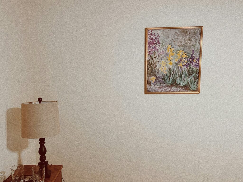
Work from a Fixed Element
Before bringing a single paint chip home, look at what you can’t change (or don’t want to): flooring, cabinetry, countertops, and major furniture. These pieces lock in certain tones warm oak floors, gray marble, cherry wood, or a navy sofa and they’re your foundation. Don’t fight them.
Instead, use these fixed elements as a guide. Pull colors that harmonize or offer gentle contrast. If your floors are warm toned, stick with equally warm wall shades for a cohesive look, or go for a cool neutral if you want contrast with edge. Either way, match the mood not just the color.
And don’t just eyeball it under one kind of light. Paint swatches in a few finalists and try them on different walls. Watch them throughout the day. What works in bright morning sun might read dull at dusk. Your room lives in real lighting conditions, not on a Pinterest board.
Embrace Modern Neutrals Wisely

The neutral palette has shifted. Gone are the icy whites and sterile grays of the early 2020s. In 2026, it’s all about warmth with taupes, soft whites, and cozy grays that feel more lived in and forgiving. These tones ground a room without washing it out, creating a base layer that feels intentional not bland.
But warmth doesn’t come from color alone. Flat beige walls won’t cut it. The key is layering: mix matte and gloss finishes, soft fabrics with structured furniture, maybe a suede throw against linen curtains. Texture brings depth where plain color falls flat.
And to keep things from getting too safe? Add pops of saturated color. Rust, olive, deep navy just one or two elements can give life to a room anchored in neutrals. It’s not about chaos. It’s about contrast that makes your palette feel personal instead of generic.
Consider the Room’s Size and Shape
The size and layout of a space should directly influence your color choices. With the right palette and visual techniques, you can make a room feel larger, cozier, or more balanced. Here’s how to strategically use color to shape perception:
Use Light to Open Up a Space
Light colors such as soft whites, creams, and pale pastels reflect more light
They make walls feel like they recede, giving an open and airy feel
Great for smaller spaces, rooms with low ceilings, or areas with limited natural light
Tip: Try off white with warm undertones instead of pure white for a softer, more inviting finish.
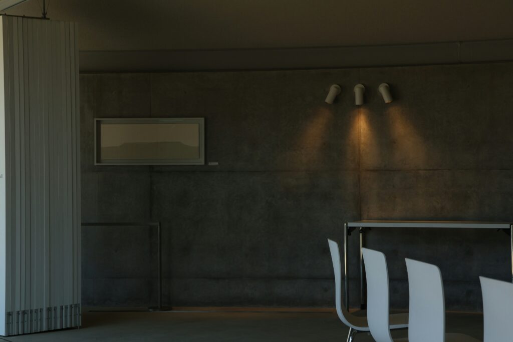
Lean Into Darkness for Intimacy
Dark colors like navy, deep green, or charcoal add drama and coziness
They visually compress space, making large rooms feel more grounded and intimate
Use in dining rooms, reading nooks, or bedrooms where comfort is key
Balance idea: Pair dark walls with lighter furnishings or metallic accents to avoid a heavy look.
Play with Patterns to Shift Proportions
Vertical stripes draw the eye upward, making ceilings appear taller
Horizontal stripes expand a wall visually, ideal for making narrow rooms feel wider
Stripes can be subtle (tone on tone) or bold (contrasting colors) depending on your style
Design reminder: Use painter’s tape for clean, precise lines when creating striped patterns.
With thoughtful use of color and pattern positioning, even the most awkwardly shaped room can feel just right.
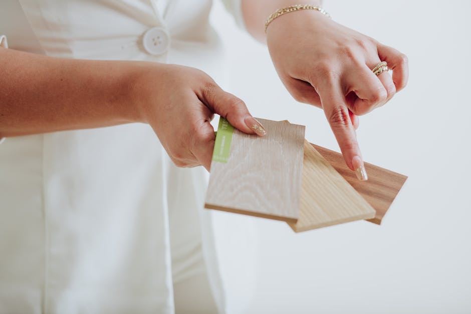
Try a Visual Plan Before You Paint
Guesswork leads to repaints. Avoid it by testing your ideas before a drop of paint hits the wall. Start with digital tools apps like Canva, Coolors, or Adobe Color let you mix and match palettes quickly, giving you a sharp preview of how tones interact. Some paint brands also offer AR features that show how a color looks in your real room.
Then, build a quick mood board. Doesn’t have to be fancy. Just grab swatches from the hardware store, snip fabric samples, and pin up texture references. Lay them out together and see how they play. The key is seeing combinations in context, not in isolation.
And yes, bold color works even in small spaces. The trick is intention. If you’ve planned it well, deep navy or burnt orange can add depth rather than overwhelm. It’s not about playing it safe. It’s about playing it smart.
(Need help? Check out 7 Clever Small Space Decorating Ideas That Actually Work)
Stick to What You Love
Trends come and go. What looks fresh this year could feel dated next year and it probably will. That’s the cycle. But here’s the deal: none of it matters if you actually like what you see every day in your space. Your gut knows what feels right. Lean on that.
A color palette that makes you feel grounded, energized, or just plain happy is always the right one. Mood matters more than what’s circulating on design blogs this month. So while it’s fine to draw inspiration from what’s trending, anchor your choices in what speaks to you.
Ultimately, your space has to work for you. Not for Pinterest, not for visitors. So trust your eye, commit to what you love, and don’t sweat what’s “in.”
 Tamarase Crisman has opinions about interior decorating tips. Informed ones, backed by real experience — but opinions nonetheless, and they doesn't try to disguise them as neutral observation. They thinks a lot of what gets written about Interior Decorating Tips, Sustainable Living Practices, DIY Home Projects is either too cautious to be useful or too confident to be credible, and they's work tends to sit deliberately in the space between those two failure modes.
Reading Tamarase's pieces, you get the sense of someone who has thought about this stuff seriously and arrived at actual conclusions — not just collected a range of perspectives and declined to pick one. That can be uncomfortable when they lands on something you disagree with. It's also why the writing is worth engaging with. Tamarase isn't interested in telling people what they want to hear. They is interested in telling them what they actually thinks, with enough reasoning behind it that you can push back if you want to. That kind of intellectual honesty is rarer than it should be.
What Tamarase is best at is the moment when a familiar topic reveals something unexpected — when the conventional wisdom turns out to be slightly off, or when a small shift in framing changes everything. They finds those moments consistently, which is why they's work tends to generate real discussion rather than just passive agreement.
Tamarase Crisman has opinions about interior decorating tips. Informed ones, backed by real experience — but opinions nonetheless, and they doesn't try to disguise them as neutral observation. They thinks a lot of what gets written about Interior Decorating Tips, Sustainable Living Practices, DIY Home Projects is either too cautious to be useful or too confident to be credible, and they's work tends to sit deliberately in the space between those two failure modes.
Reading Tamarase's pieces, you get the sense of someone who has thought about this stuff seriously and arrived at actual conclusions — not just collected a range of perspectives and declined to pick one. That can be uncomfortable when they lands on something you disagree with. It's also why the writing is worth engaging with. Tamarase isn't interested in telling people what they want to hear. They is interested in telling them what they actually thinks, with enough reasoning behind it that you can push back if you want to. That kind of intellectual honesty is rarer than it should be.
What Tamarase is best at is the moment when a familiar topic reveals something unexpected — when the conventional wisdom turns out to be slightly off, or when a small shift in framing changes everything. They finds those moments consistently, which is why they's work tends to generate real discussion rather than just passive agreement.