Layering Without Clutter
Texture adds character, but it can also overwhelm if you’re not careful. The goal isn’t to turn your living room into a fabric store; it’s to build contrast that feels effortless. Start simple: pair thick knit throws with smooth linen curtains or bedding. It’s a move that adds warmth without bulk.
On the floor, skip the oversized shag. Instead, layer a flatweave rug over a durable sisal or jute base. The textured layering grounds the space without making it heavy. Think of it as anchoring the room with depth, not distraction.
When it comes to furniture, lean into variety. A velvet sofa adds softness and a bit of sheen. Bouclé cushions bring tactile comfort, while leather accents like a side chair or ottoman cut in with a touch of edge. The mix works best when the colors stay neutral and the silhouettes stay clean. Texture should invite, not compete.
Contrast with Natural Elements
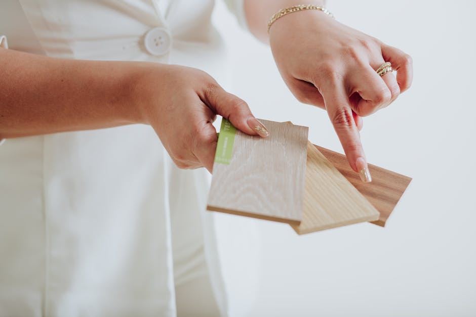
Walk into a room with real materials and you feel it. Wood grains bring warmth, stone adds quiet weight, and textures like rattan and jute bring in easygoing, lived in character. These organic finishes do more than look good they ground a space without trying hard.
But it’s not all about rustic. Juxtapose those earthy textures with slick materials like metal or glass, and your room suddenly gets edge and modernity. Picture a raw oak coffee table with a brushed steel base. Or a glass vase sitting on a jute runner. Mixing rough and refined is the sweet spot.
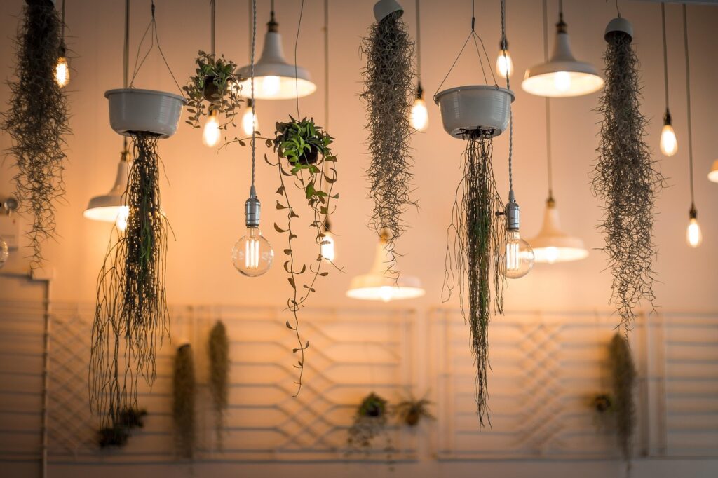
Then layer in plants not just as decor, but as active texture. Go beyond basic green; think large leafy monsters next to trailing vines, or contrast a rubber plant’s waxy surface with a fuzzy calathea. Shape, size, color diversity in foliage pushes your space from flat to full.
Texture doesn’t have to shout. Done right, it invites people in without saying a word.
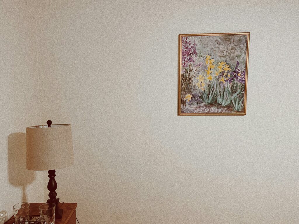
Visual Texture on the Walls
Walls don’t need to shout to make an impact. A layer of grasscloth or textured wallpaper adds quiet depth it turns a blank wall into a surface with presence. You don’t even need bold colors; the tactile feel alone makes the space feel more lived in.
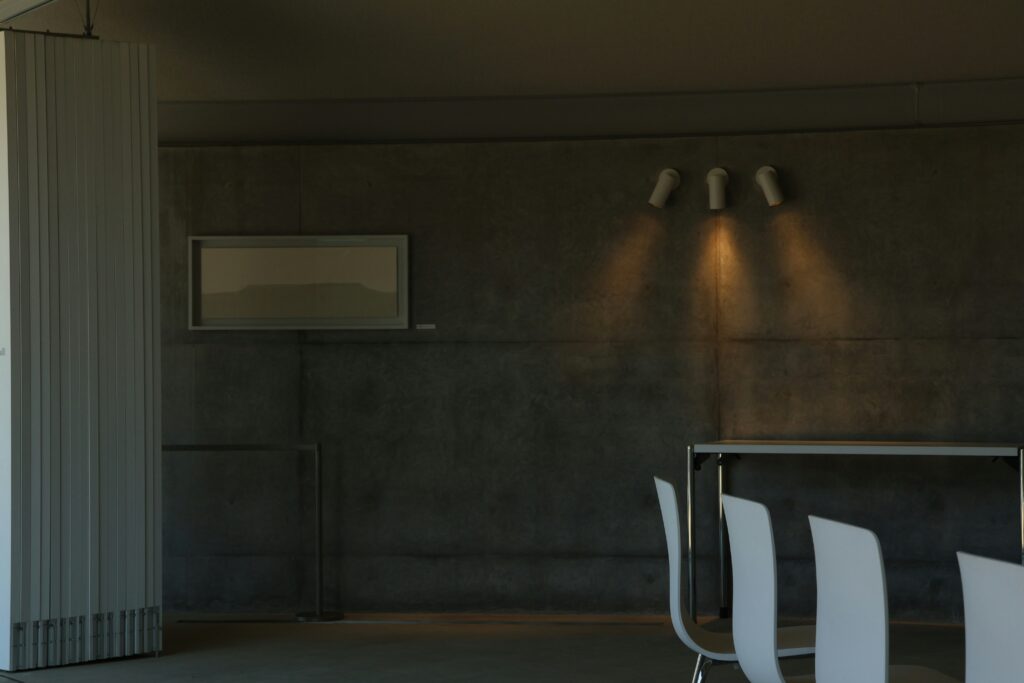
If you’re after something more architectural, plaster finishes or slatted wood paneling add dimension through shadowplay. These materials catch light in subtle ways and bring a handcrafted, grounded feel to your space.
Paint still holds its own, though. Mixing matte and gloss within the same wall or even the same color can shift the way light bounces around the room. It’s an old school trick that still works if you’re after low effort, high reward texture.
Mixing Patterns the Right Way
Pattern mixing isn’t about going wild it’s about pacing and control. Start by picking a dominant pattern. Could be a bold floral on curtains or a geometric print on a rug. Whatever it is, let it lead. That anchor keeps the room grounded when you layer in stripes, checks, or a secondary floral.
Next, stay honest with your color palette. Pull two or three key hues from your anchor pattern and echo them in supporting pieces. That’s how you mix a painterly floral with sharp geometrics and still get harmony, not chaos.
Keep complex or heavily detailed patterns limited to accents throw pillows, side chairs, framed fabric art. Let the main furniture pieces stay calmer in solid tones or minimal prints. It keeps the eye from working overtime.
Strategic restraint goes a long way. You’re adding rhythm to your space, not noise.
Related read: The Dos and Don’ts of Mixing Patterns in Interior Design
Texture in Unexpected Places
Texture doesn’t have to stop at rugs and upholstery. The best spaces sneak it into corners you didn’t expect. One solid move: textile art on the walls. Sculptural fabric pieces think framed woven panels or hanging macramé give rooms depth without adding clutter. They pull your eye in, slow it down.
Then there’s lighting. Ditch the boring builder grade fixtures. Swapping in a hammered metal sconce or a woven pendant changes the entire mood of a room. These finishes catch light differently less shine, more soul.
Finally, shelves are more than storage. They’re staging areas. Rough pottery, hand molded ceramics, anything with uneven edges or matte finishes they all create visual friction. It’s the kind of detail that makes a space feel touched by a human hand, not just styled by an algorithm.
Keep It Cohesive
Texture works best when it’s anchored by a clear visual thread. A unified color palette especially neutrals or earth tones lets the layering of different materials shine without becoming overwhelming. Think oat colored linen curtains against a sandy toned jute rug, or a taupe boucle chair next to a walnut side table. These tones don’t compete; they calm the space and highlight the materials themselves.
Repetition is your secret weapon. Echo key textures or materials like brushed brass or raw wood in more than one room. A rattan pendant light in the kitchen can relate back to a rattan wrapped mirror in the hallway. When similar materials pop up repeatedly, the space feels considered.
Instead of relying on bold color for impact, lean into variation in shape or sheen. Combine curved, organic forms with sharp, clean lines. Pair matte clay vases with glossy ceramic ones. This contrast adds interest without breaking the visual rhythm. Ultimately, cohesion isn’t about sameness it’s about harmony.
2026’s Texture Trends to Watch
This year’s design trends are shifting toward bold simplicity and mindful material choices. At the forefront? Oversized, low profile bouclé chairs. They’re plush without being fussy, sculptural without shouting perfect for grounding a room while adding a soft, tactile element.
Concrete is also having a moment not the cold, brutalist kind, but sculpted, smoothed, and often 3D printed to create pieces that double as art. Think side tables with waves, bookshelves with curves, and accent decor that feels handmade, not mass produced.
Then there’s the rise of sustainable textiles. Hemp, cork, and recycled fibers are showing up everywhere from throw pillows to upholstery. They offer rich texture and natural variation, without sacrificing ethics or performance. In 2026, texture isn’t about visual noise it’s about intentional, layered choices that make space feel lived in, but dialed in.
 Norvain Zyphoris has opinions about home design inspirations. Informed ones, backed by real experience — but opinions nonetheless, and they doesn't try to disguise them as neutral observation. They thinks a lot of what gets written about Home Design Inspirations, DIY Home Projects, Gardening and Landscaping Ideas is either too cautious to be useful or too confident to be credible, and they's work tends to sit deliberately in the space between those two failure modes.
Reading Norvain's pieces, you get the sense of someone who has thought about this stuff seriously and arrived at actual conclusions — not just collected a range of perspectives and declined to pick one. That can be uncomfortable when they lands on something you disagree with. It's also why the writing is worth engaging with. Norvain isn't interested in telling people what they want to hear. They is interested in telling them what they actually thinks, with enough reasoning behind it that you can push back if you want to. That kind of intellectual honesty is rarer than it should be.
What Norvain is best at is the moment when a familiar topic reveals something unexpected — when the conventional wisdom turns out to be slightly off, or when a small shift in framing changes everything. They finds those moments consistently, which is why they's work tends to generate real discussion rather than just passive agreement.
Norvain Zyphoris has opinions about home design inspirations. Informed ones, backed by real experience — but opinions nonetheless, and they doesn't try to disguise them as neutral observation. They thinks a lot of what gets written about Home Design Inspirations, DIY Home Projects, Gardening and Landscaping Ideas is either too cautious to be useful or too confident to be credible, and they's work tends to sit deliberately in the space between those two failure modes.
Reading Norvain's pieces, you get the sense of someone who has thought about this stuff seriously and arrived at actual conclusions — not just collected a range of perspectives and declined to pick one. That can be uncomfortable when they lands on something you disagree with. It's also why the writing is worth engaging with. Norvain isn't interested in telling people what they want to hear. They is interested in telling them what they actually thinks, with enough reasoning behind it that you can push back if you want to. That kind of intellectual honesty is rarer than it should be.
What Norvain is best at is the moment when a familiar topic reveals something unexpected — when the conventional wisdom turns out to be slightly off, or when a small shift in framing changes everything. They finds those moments consistently, which is why they's work tends to generate real discussion rather than just passive agreement.